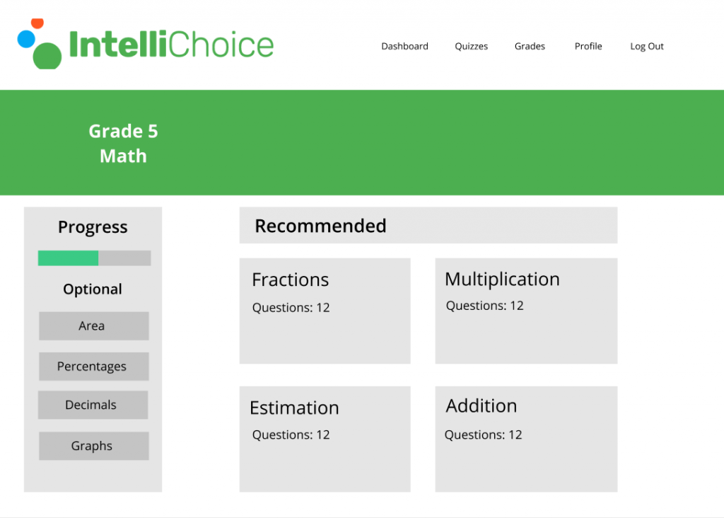
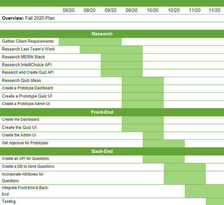
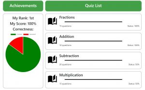
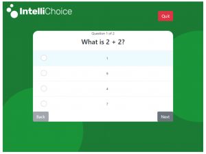
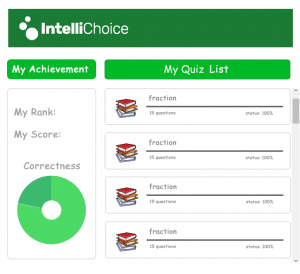
We took Dr. Lee’s feedback on how the quizzes should be structured and began designing a frontend wireframe for it on Figma. Our design included lots of colors and big icons. We showed our design to the lead technological developer at IntelliChoice, Arthur, to receive feedback.
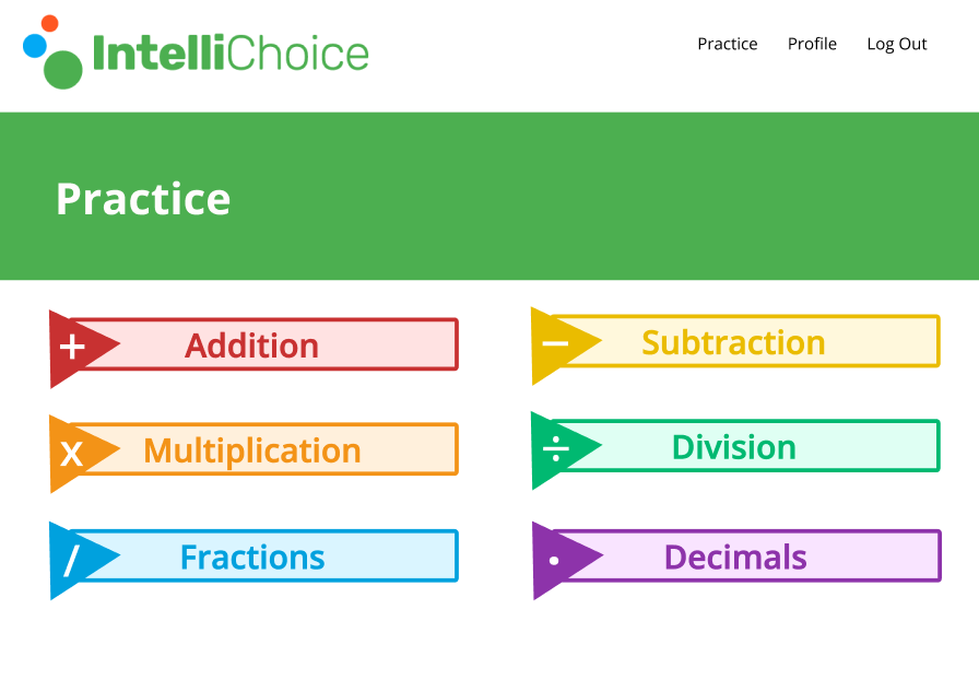
We received feedback from Arthur and learned that the button were too big. However, Arthur liked the idea of making everything colorful as it appeals to the younger audience. We began working on the react app with the feedback in mind.
Our teams split up into those who were working on frontend and those who were working with backend. The frontend developers worked on creating a nice user interface in react while the backend worked on sorting out topics and subtopics so that tutors can add them and qui questions.
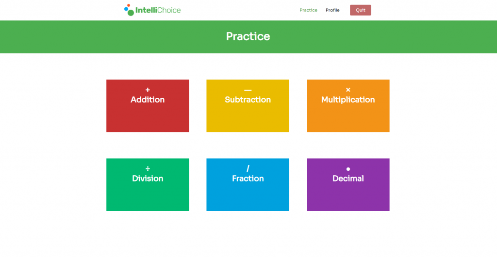
There would be a navigation bar at the top to navigate across different sections of the page. There will be a homepage, a practice page for the quizzes, a profile page to display student information, and a quit page to send the user back to the IntelliChoice main page.
The math topics will be partitioned up and have different colors associated with them. With allows for ease of navigation, excellent organization, and appealing colors. By click on the boxes, it would send the user to a subtopics page for even more partitioning, but that’s for future semesters to work on.
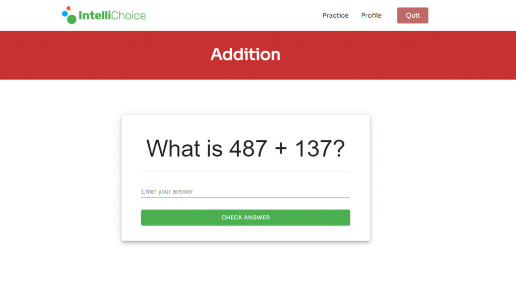
Instead, clicking a topics page will send the user to a sample quiz that they take depending on the subject they choose.


We have ended off the semester by completing a working random quiz generator. The future semesters will work on adding a next question button and show answer button for the quizzes, make it possible for tutors to edit subjects and quiz questions, and deliver the project to the client.
